import os # os for "operating system"
# "mkdir" stands for "make directory" (a "directory" is just a folder!)
os.mkdir('data')
os.mkdir('output')Intro to Data Visualization in Python
This tutorial will demonstrate how to read in data from a file in Python and create a basic plot using three different tools: matplotlib, seaborn, and plotnine.
Learning Objectives
- Gain familiarity with Python
- Read in data from a file using Pandas
- Visualize data in a graph (scatterplot)
For this tutorial, we’ll be using data from gapminder. gapminder promotes sustainable development goals by increasing use of statistics about social, economic, and environmental development. This dataset is at the national level and includes GDP per capita, life expectancy, and population statistics.
Use this link to download the dataset (right-click on the link and select Save As...). Make sure to save it somewhere you’ll remember, like your Desktop or Downloads. We’ll be moving it somewhere else later.
Setup
Before we get into the nitty-gritty of this tutorial, first we need to set up our development environment.
We will first create two folders, one called data and one called output, inside the project folder we just created. To do this using Python, we can run the following code:
Once you’ve created the two folders, we’ll move the data we just downloaded into your new data folder. Drag and drop the data file from where you saved it into the data folder.
ImportantPackage installation for Colab (or otherwise)
If you’re using Google Colab, run the pip command below to make sure these packages are installed. If you have a local installation and use either pip or uv to install packages, you can still run the code below if there are any packages you need to install.
pip command
!pip3 install pandas matplotlib seaborn plotnine jupyteruv command (local installs)
# ideally, run this in Terminal without the !,
# if installing locally!
!uv add pandas matplotlib seaborn plotnine jupyter
P.S. if you want to get set up to write Python on your own machine, follow the instructions found on the Getting Started page.
Import packages
Importing packages in Python is like opening an application on your phone or your computer. When you want to write a paper or something similar, you might open Microsoft Word or Google Docs and then create your document. We open the application so we can use it, and importing is the same idea!
import pandas as pd # pd is an "alias" for pandas, basically shorthand!
import matplotlib.pyplot as plt
import seaborn as sns
# Below is a different type of import, we're importing "all" (aka *) the contents of plotnine,
# so we won't have to refer to "plotnine" the whole time.
from plotnine import *
Reading in our data
First, let’s read the data we downloaded into a Pandas DataFrame. Because the data is in our data folder, we need to tell Python to look inside that folder to find the .csv file. This is called a “relative path”, or “the path to get to the file we want from where we are”. The / indicates that gapminder-FiveYearData.csv is inside the data folder.
We call gap_5_yr.head() after reading in the data to take a look at the first 5 rows of our dataframe, which is often super useful to reference.
gap_5_yr = pd.read_csv('data/gapminder-FiveYearData.csv')
gap_5_yr.head()| country | year | pop | continent | lifeExp | gdpPercap | |
|---|---|---|---|---|---|---|
| 0 | Afghanistan | 1952 | 8425333.0 | Asia | 28.801 | 779.445314 |
| 1 | Afghanistan | 1957 | 9240934.0 | Asia | 30.332 | 820.853030 |
| 2 | Afghanistan | 1962 | 10267083.0 | Asia | 31.997 | 853.100710 |
| 3 | Afghanistan | 1967 | 11537966.0 | Asia | 34.020 | 836.197138 |
| 4 | Afghanistan | 1972 | 13079460.0 | Asia | 36.088 | 739.981106 |
We can learn about the columns in our data using the pd.DataFrame.info() method.
gap_5_yr.info()<class 'pandas.DataFrame'>
RangeIndex: 1704 entries, 0 to 1703
Data columns (total 6 columns):
# Column Non-Null Count Dtype
--- ------ -------------- -----
0 country 1704 non-null str
1 year 1704 non-null int64
2 pop 1704 non-null float64
3 continent 1704 non-null str
4 lifeExp 1704 non-null float64
5 gdpPercap 1704 non-null float64
dtypes: float64(3), int64(1), str(2)
memory usage: 80.0 KBThe dtype column tells us what data types are present in our dataset. Notice that country and continent are type str: these are “strings” otherwise known as collections of characters inside quotes (single or double). We typically use these for categories or words, such as country names. The data type float64 essentially just refers to decimal numbers (no need to go deeper than that for this tutorial, or most things).
We can also access a table of summary statistics for numeric variables in our dataset using the pd.DataFrame.describe() method.
gap_5_yr.describe()| year | pop | lifeExp | gdpPercap | |
|---|---|---|---|---|
| count | 1704.00000 | 1.704000e+03 | 1704.000000 | 1704.000000 |
| mean | 1979.50000 | 2.960121e+07 | 59.474439 | 7215.327081 |
| std | 17.26533 | 1.061579e+08 | 12.917107 | 9857.454543 |
| min | 1952.00000 | 6.001100e+04 | 23.599000 | 241.165876 |
| 25% | 1965.75000 | 2.793664e+06 | 48.198000 | 1202.060309 |
| 50% | 1979.50000 | 7.023596e+06 | 60.712500 | 3531.846988 |
| 75% | 1993.25000 | 1.958522e+07 | 70.845500 | 9325.462346 |
| max | 2007.00000 | 1.318683e+09 | 82.603000 | 113523.132900 |
Now that we’ve taken a look at the data, let’s investigate the relationship between life expectancy and GDP as part of creating our first plot.
Your first plot in Python!
We’ll start by using matplotlib, which is the base plotting package in Python! It sorta underpins all other tools - it was definitely the first.
Let’s break down the code below. The .plot method initiates the creation of the plot. Inside of the method call, we pass three arguments which tell matplotlib how we want our plot to look:
x: the name of the column to use for the x-axis in our plot. The name must exactly match the name of the column in our dataset (even capitalization!)y: the name of the column to use for the y-axis in our plot.kind: the type of plot to make. In our case'scatter'means we want an X-Y scatterplot.
We save our plot to the variable ax_plt1 to store the “axis object” of the plot. We’ll use it soon!
plt.show() tells matplotlib to show the current figure (which is our plot!).
ax_plt1 = gap_5_yr.plot(x = 'gdpPercap', y = 'lifeExp', kind = 'scatter')
plt.show()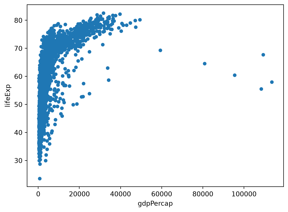
Making it pretty
Change the scale: log-transform GDP per capita
It’s difficult to see the relationship between GDP and life expectancy because of the scale of GDP, but it doesn’t look linear. Let’s log-transform GDP so we can see the relationship better.
To do this, we add the argument logx = True to our plot method call. Make sure to add a , after kind = 'scatter' - arguments are separated by commas!
ax_plt1 = gap_5_yr.plot(x = 'gdpPercap',
                        y = 'lifeExp',
                        kind = 'scatter',
                        logx = True)
plt.show()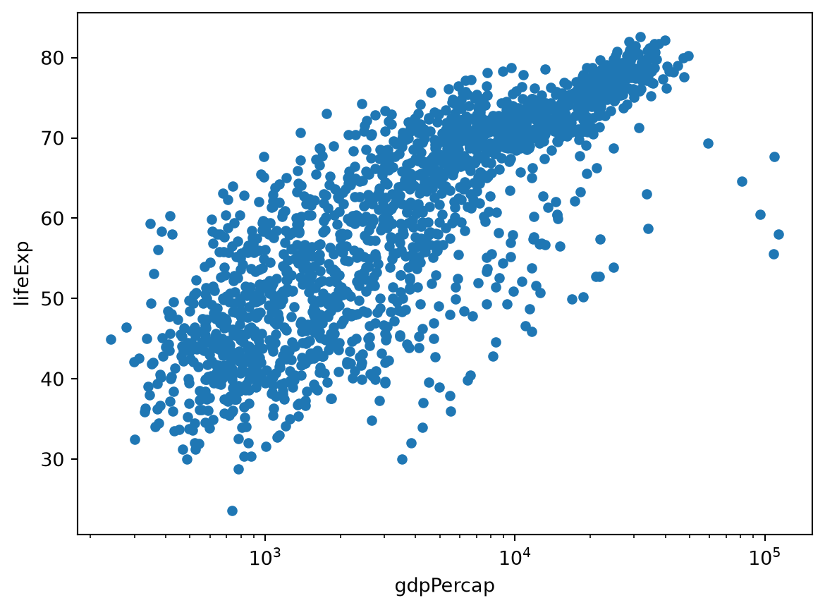
Update axis labels and title
We can also update the labels on the X and Y axes to be easier to read by referring to the variable ax_plt1, which refers to the axes of this plot. It contains a bunch of methods we can use to edit the plot itself.
We’ll use ax.set_xlabel, ax.set_ylabel, and ax.set_title:
# previous plot code
ax_plt1 = gap_5_yr.plot(x = 'gdpPercap',
                        y = 'lifeExp',
                        kind = 'scatter',
                        logx = True)
# set the labels
ax_plt1.set_xlabel('GDP per capita (Log($))')
ax_plt1.set_ylabel('Life expectancy (years)')
ax_plt1.set_title('Life expectancy vs. GDP')
plt.show()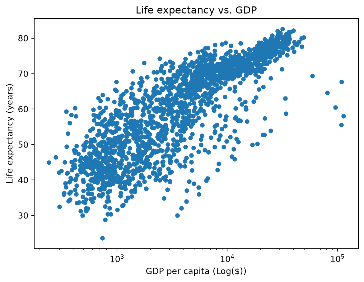
Make it prettier
Changing colors
By default, matplotlib generally will use blue as the initial color for the points or lines in your plot. We aren’t restricted to that! For this plot, let’s assign point colors based on the continent a country belongs to. The lines where ‘# added’ follows the code indicate the changes made.
The two arguments we’re adding to the code are c = 'continent' and cmap = 'Accent'. c indicates what column we want to be used to designate colors (i.e., which color contains the groups we’re interested in). cmap indicates the color palette we want to use. You can take a look at the matplotlib documentation here to see color palette (or, colormap) options.
# we're going to ignore the warning for this plot
import warnings
warnings.filterwarnings('ignore')

# create plot
ax_plt1 = gap_5_yr.plot(x = 'gdpPercap',
                        y = 'lifeExp',
                        kind = 'scatter',
                        logx = True,
                        c = 'continent', # added
                        cmap = 'Accent') # added
# set the labels
ax_plt1.set_xlabel('GDP per capita (Log($))')
ax_plt1.set_ylabel('Life expectancy (years)')
ax_plt1.set_title('Life expectancy vs. GDP')
plt.show()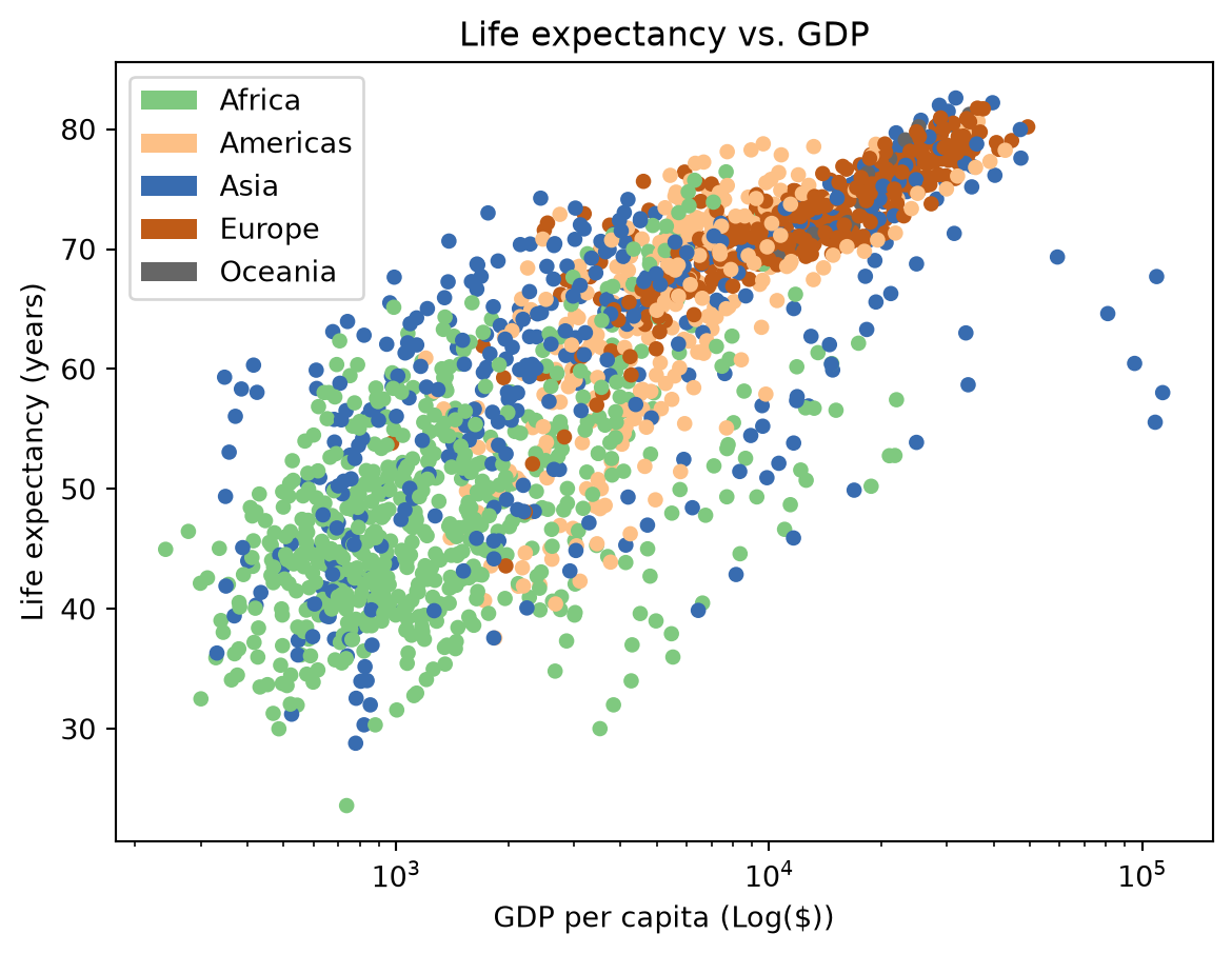
Saving graphical output
(with matplotlib)
To save your plot to a file that can be used in a presentation or a publication, we can use the plt.save_fig function. It saves the most recently generated figure:
plt.savefig('output/lifeExp_vs_log_GDP.jpg')Another one! Plotting with Seaborn

Matplotlib is the original, but there are other packages that create really beautiful and more aesthetic plots right out of the box. Seaborn is a data visualization library built on top of matplotlib that provides a sometimes simpler interface for creating “attractive and informative statistical graphics”.
To create an equivalent scatterplot to the plot above, we’ll use sns.scatterplot.
In addition to supporting some of the matplotlib color palettes, seaborn introduces some of their own. We can set all the same features, but the syntax and names of arguments might be different - pay attention to the differences between this plot and the one above!
Creating the scatterplot
Let’s discuss some of the differences here:
- In the previous example, we called
.plotongap_5_yr. Withseaborn, we call thescatterplotfunction by referring to the package (shortened tosns). - Because we haven’t referred to
gap_5_yryet, we have to pass it as an argument to thescatterplotfunction using thedatakeyword (data = gap_5_yr). - Instead of
c, we provide the column containing the categories for colors using thehueargument (hue = 'continent'). - Instead of
cmap, we set the color palette using thepaletteargument (palette = 'colorblind'). - We add a new argument here
alpha = 0.9which makes the points slightly less opaque. You can try messing with the value to see how it affects the points!
p2_ax = sns.scatterplot(
    data = gap_5_yr,
    x = 'gdpPercap',
    y = 'lifeExp',
    hue = 'continent', # setting variable for color
    palette = 'colorblind', # setting same colormap from matplotlib
    alpha = 0.9, # setting opacity -- this is new!
)
# update x scale using matplotlib!
plt.xscale('log')
# set labels the same way
p2_ax.set_xlabel('GDP per capita (log($))')
p2_ax.set_ylabel('Life expectancy (years)')
p2_ax.set_title('Life expectancy vs. GDP')
plt.show()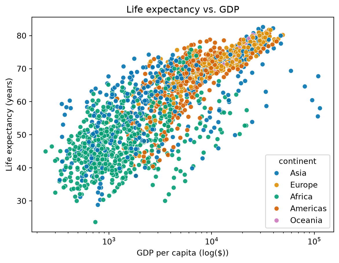
As we can see, we’re using the same methods (e.g., set_xlabel, etc.) to update the labels of this plot. That’s because seaborn is built on top of (or, inherits) some methods and keyword arguments from matplotlib.
The last key difference here is that the easiest way to set the x-scale to logarithmic is by using matplotlib instead of going through seaborn. We use the plt.xscale('log') function call to set the x-scale to a logarithmic scale using the matplotlib package.
When using seaborn, you will likely find it helpful to have matplotlib imported as well in order to make changes like the one above!
Creating a facet plot
Here’s an example of a plot that is slightly easier to create with seaborn, though altering each of the plots individually would still be a challenge (and involve matplotlib). Below is a facet-plot or facet-grid (sns.relplot). A facet plot set of small subplots that share the same scale and structure. Each individual panel displays a different subset of a dataset split by a category. In this case, we’re going to create the same plot as above but with a separate subplot for each continent:
p3_ax = sns.relplot(
    data = gap_5_yr,
    x = 'gdpPercap',
    y = 'lifeExp',
    hue = 'continent',
    col = 'year', # the variable to facet by
    palette = 'colorblind',
    col_wrap=3, # how many columns of plots to create
    height=2,
    alpha = 0.9
)
plt.xscale('log') # we can use the same matplotlib function to change the x-scale!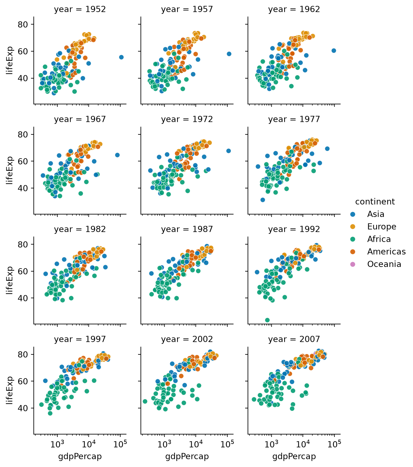
Saving
To save the plot above, you would use the exact same syntax as above in Section 3.3.
There are other (perhaps cooler!) plots that can be made using seaborn. Check out the seaborn gallery for more inspiration!
Plotting with plotnine (this one’s for you, R friends)
The last section of this tutorial will focus on a package that was created to support a similar syntax to the popular R visualization package ggplot2 in Python. plotnine is based on the grammar of graphics, a coherent system for describing and building graphs. The idea behind the Grammar of Graphics is that visualizations have layers of independent features, which makes building figures more intuitive as each layer is added independently.
Let’s create the above scatterplot, again, using plotnine. Note: the syntax looks a little different from the code we wrote before. It’s not “traditional” Python syntax and for some people it takes some getting used to.
Create the figure
First, we need to create the figure. To do this, we use the ggplot function along with the aes function to 1. initialize the plot and 2. set the “aesthetics”, aka, which variables are being used for each dimension of our plot:
(
    ggplot(gap_5_yr, aes(x = 'gdpPercap', y = 'lifeExp'))
)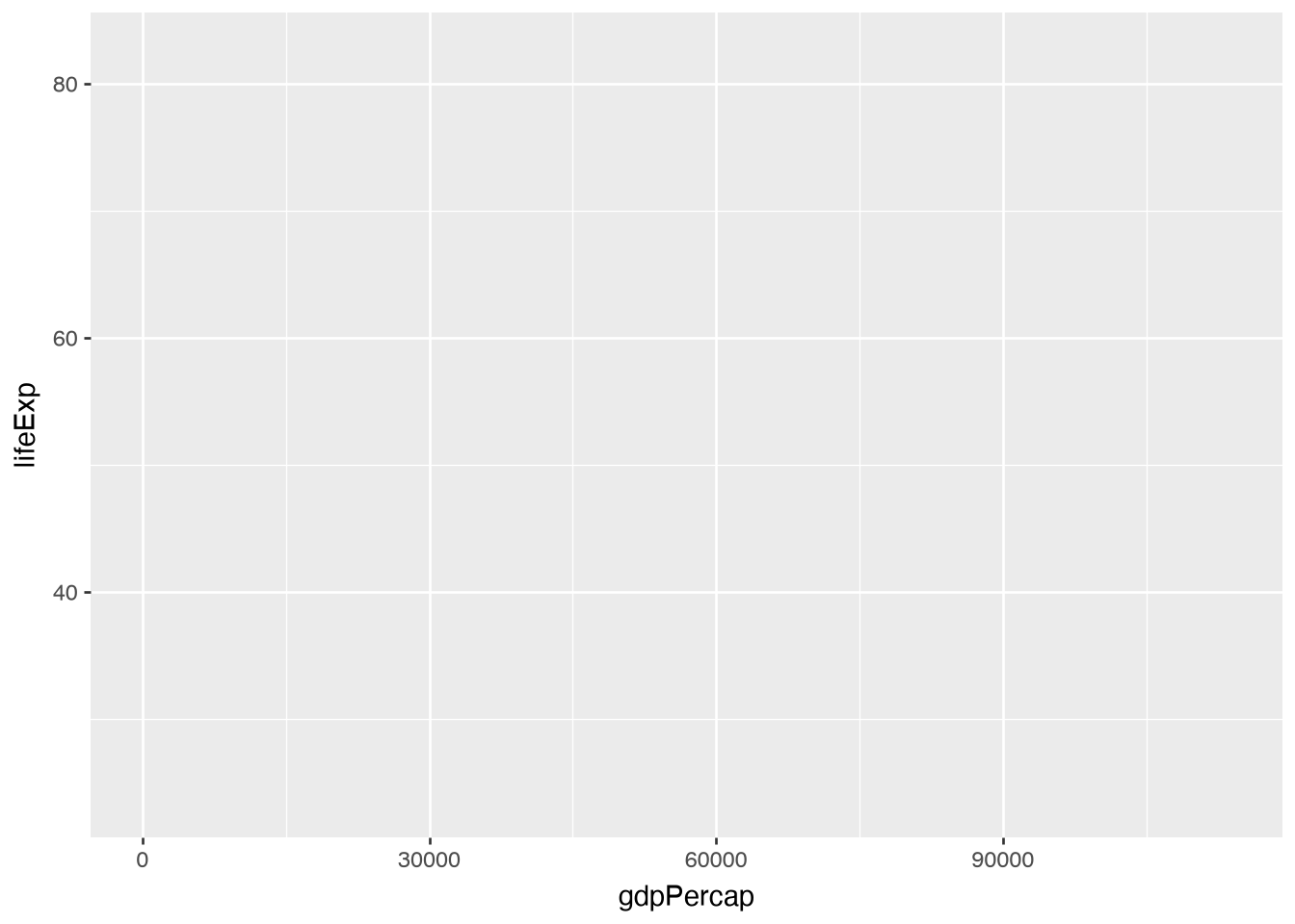
Notice I added the () around the ggplot function - we’re going to be using a different form of chaining functions, the + sign, to build our plot. In order to make it easier to read, we can indent our code and separate each function onto a separate line, but we need to tell Python it’s all part of the same statement.
Add points and scale
Next, to add the points of our scatterplot, we build on the previous code by adding a new “geometry” - points! We’ll add the geom_point function to our plot code.
(
    ggplot(gap_5_yr, aes(x = 'gdpPercap', y = 'lifeExp'))
    + geom_point()
)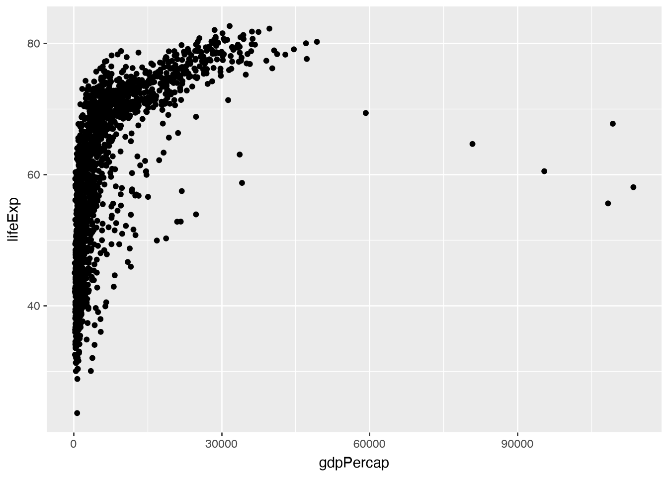
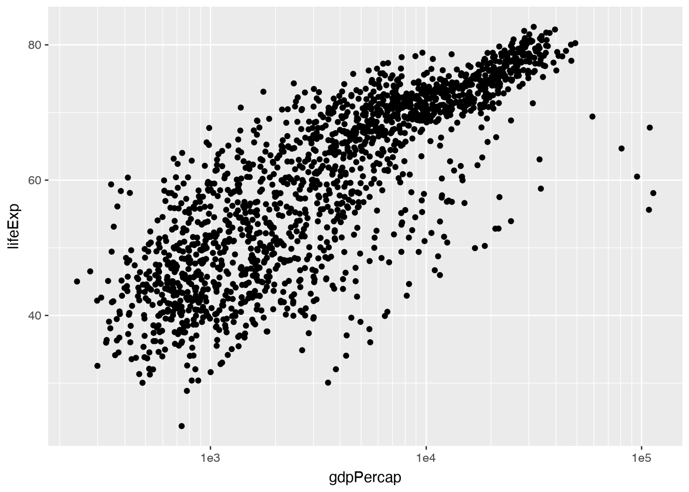
We can see that the points need to be rescaled again, on the x-axis. To do this, we add another layer by adding another function (scale_x_log10):
(
    ggplot(gap_5_yr, aes(x = 'gdpPercap', y = 'lifeExp'))
    + geom_point()
    + scale_x_log10()
)
Making it pretty!
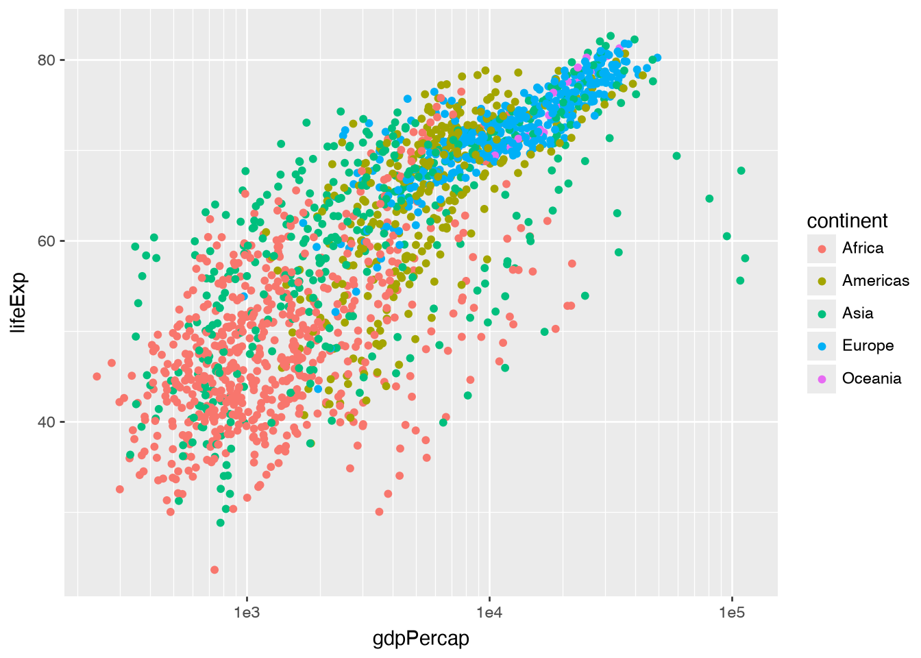
To add color to our points, we actually amend the aes call at the beginning of our plot code. All we need to do is add color = 'continent' to that function:
(
    ggplot(gap_5_yr, aes(x = 'gdpPercap', y = 'lifeExp', color = 'continent'))
    + geom_point()
    + scale_x_log10()
)
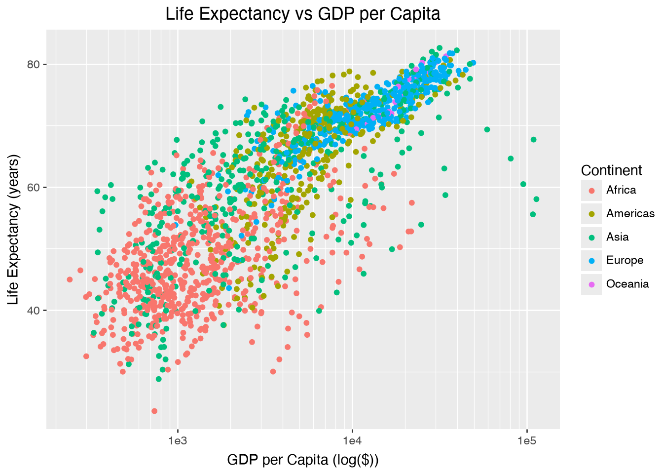
To add labels, we’ll add them as another layer to the plot with the labs function:
(
    ggplot(gap_5_yr, aes(x = 'gdpPercap', y = 'lifeExp', color = 'continent'))
    + geom_point()
    + scale_x_log10()
    + labs(
        x = 'GDP per Capita (log($))',
        y = 'Life Expectancy (years)',
        title = 'Life Expectancy vs GDP per Capita',
        color = 'Continent' # this updates the legend title!
    )
)
Making it prettier
From there, we might want to choose a color scale that is closer to the ones we selected for the matplotlib and seaborn plots.
p9_plot = (
    ggplot(gap_5_yr, aes(x = 'gdpPercap', y = 'lifeExp', color = 'continent'))
    + geom_point()
    + scale_x_log10()
    + labs(
        x = 'GDP per Capita (log($))',
        y = 'Life Expectancy (years)',
        title = 'Life Expectancy vs GDP per Capita',
        color = 'Continent' # this updates the legend title!
    )
    + scale_color_cmap_d('Accent')

)
p9_plot.show()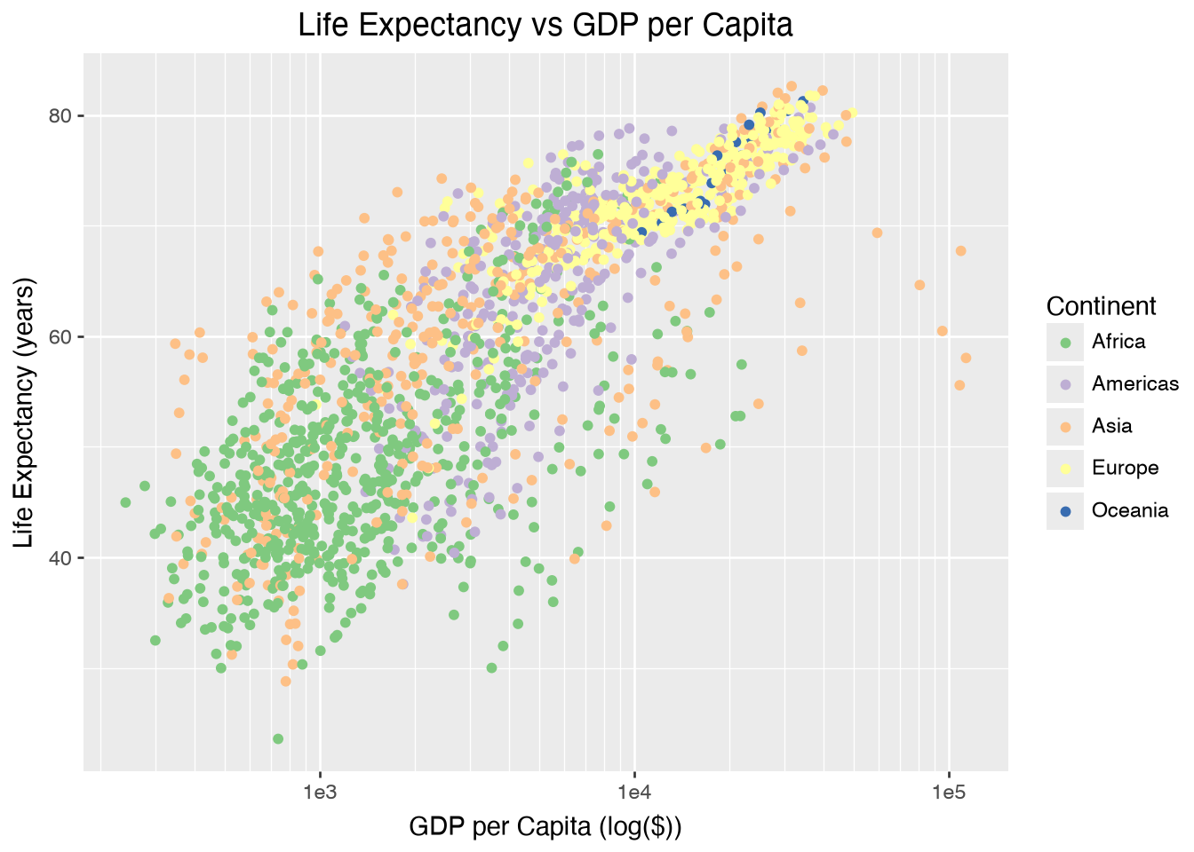
We can also change the theme of the figure, which changes the background color and grid lines, for example. Here is a list of the different themes you can select. For this tutorial, we’ll choose the theme_minimal option:
p9_plot = (
    ggplot(gap_5_yr, aes(x = 'gdpPercap', y = 'lifeExp', color = 'continent'))
    + geom_point()
    + scale_x_log10()
    + labs(
        x = 'GDP per Capita (log($))',
        y = 'Life Expectancy (years)',
        title = 'Life Expectancy vs GDP per Capita',
        color = 'Continent' # this updates the legend title!
    )
    + scale_color_cmap_d('Accent')
    + theme_minimal()
)
p9_plot.show()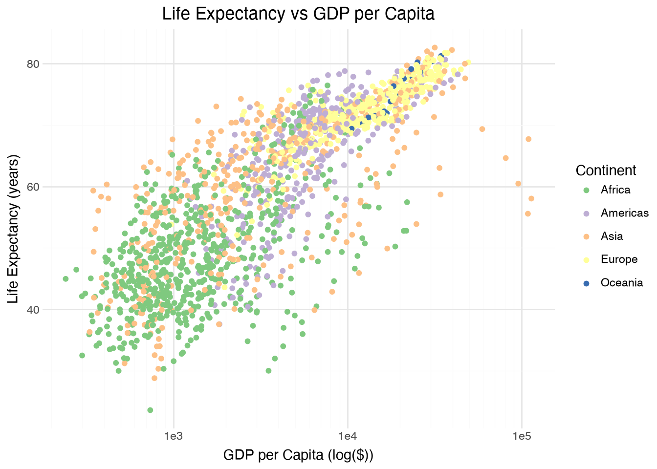
Saving
The syntax is slightly different for saving plots in plotnine, mirroring the syntax in R. To save a plotnine plot, you’ll use the plot.save() syntax. You can use the dpi = 300 keyword argument to increase the resolution of the saved output:
p9_plot.save('output/p9_lifeExp_vs_log_GDP.png', dpi = 300)Takeaways
This tutorial was intended to demonstrate three different options for creating static plots in Python.
We started out by first importing the packages we needed and reading in our data. From there, we created similar plots using three different plotting packages: matplotlib, seaborn, and plotnine. While seaborn builds on matplotlib and, therefore, their syntax is similar, plotnine takes a slightly different approach to visualization.
In addition to these three, another popular plotting package in Python is Plotly which supports interactive data visualizations.
There are many other features available within each of these packages - go forth and explore!